Redesigning Zendesk’s Trial Landing Page
Team
Product design lead:
Sara Anderson
Content design lead:
Charla Myers
Product management:
Jeannie Wu
Engineering:
Mark Fox, Jiaxiang Liu
Design leadership:
Filippo Lovotti
Product leadership:
Brian My
Background
Zendesk aims to improve engagement with its trial landing page to facilitate more immediate interaction with its core products. Despite recent successful initiatives, engagement rates remains lower than desired. Only 40% of trialists made it into the ticketing system product, and users expressed difficulty navigating to the product.

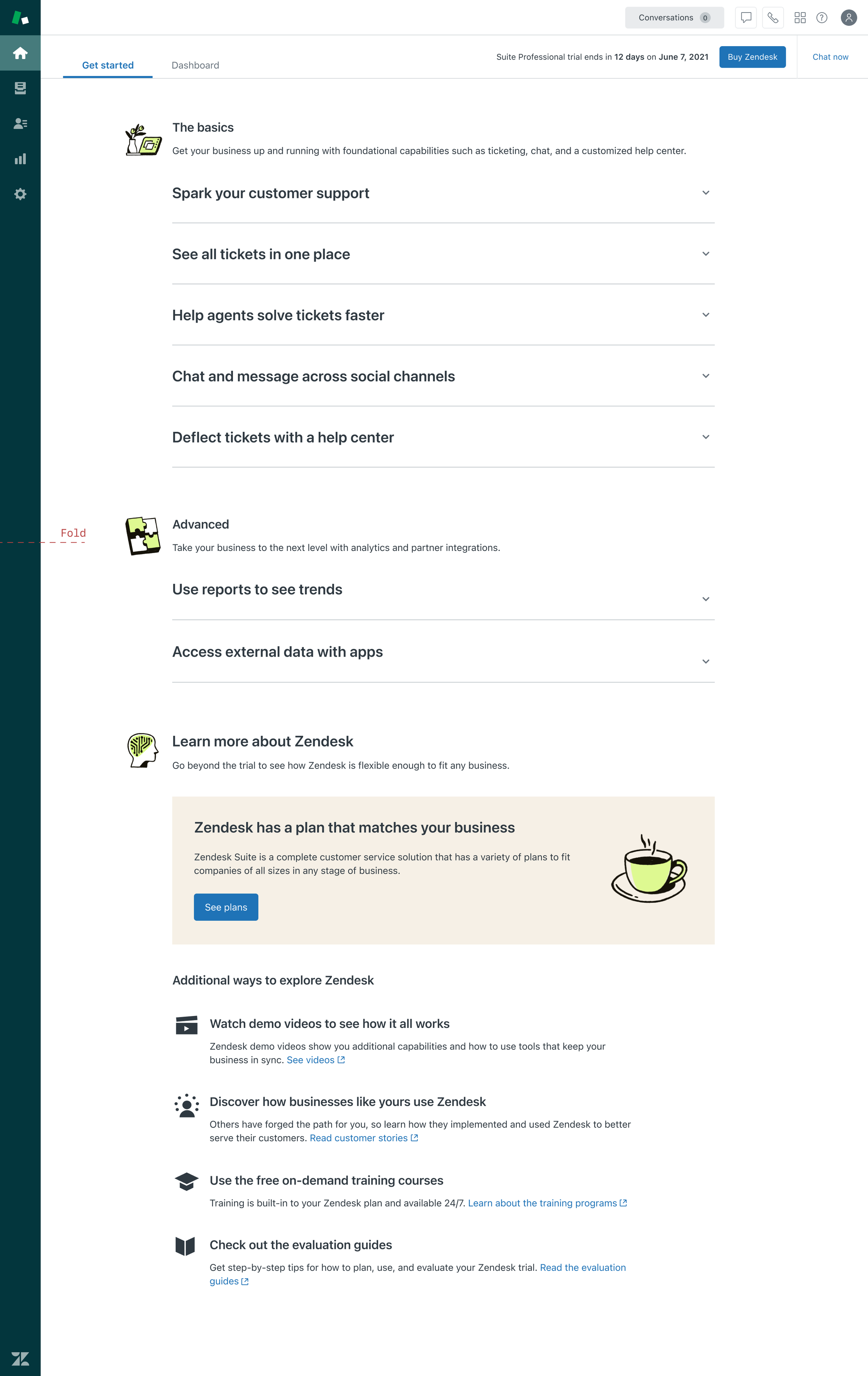
Before redesign
Vision
Overhaul the trial landing page to enhance engagement with Zendesk's core products, building upon previous successes and user feedback.

Redesigned landing page
Approach
Identify user pain points.
Define success criteria.
Conduct a SAAS audit to analyze signup to landing page flows, onboarding frameworks, and patterns.
Extract frameworks to integrate trial content into scalable patterns.
Begin design feedback loop: review > collect feedback > iterate
Hand off approved high-fidelity design to Engineering
Launch an experiment to test the redesigned landing page.
Pain points
Some users have trouble navigating to our Support product.
“I couldn’t figure out how to navigate the trial. Where do I click to see my inbox? It took me 5-10 minutes trying to navigate and then read documentation to help me.”
Only ~18% of our trialists access Ticketing
We jump right into discussing our channels before introducing Support.
Trialists want to evaluate the ease for onboarding.
“I want to determine if it’s simple enough to use and won’t increase our labor costs too much (see how hard it is to train on the tool).”
Test the end user experience is important for trialists
“Ultimately, whatever it is that we use will have an effect on our customers and how they perceive us so it's important that everything looks on brand.”
Success criteria
Increase engagement with CTAs on the page.
Higher percentage of trialists creating and commenting tickets.
Improvement in cart visit rate and engagement metrics.
Audit
Focus: analyze signup to landing page flows, onboarding frameworks, and patterns of SAAS products: Gusto, Shopify, Mailchimp, and others.
Gusto

Shopify
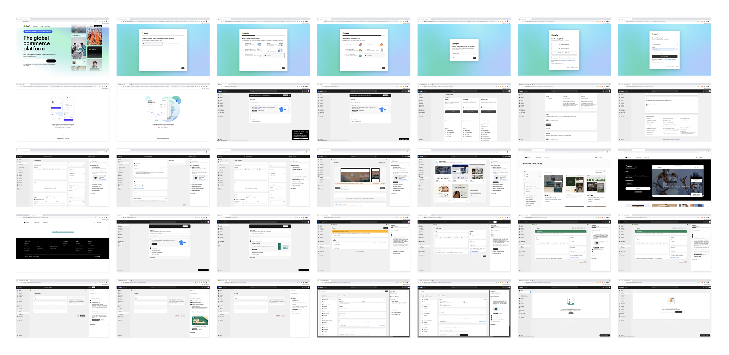
Mailchimp

Framework discovery
Focus: identify frameworks to integrate trial content into scalable patterns

Concept: content library
Hypothesis: trialists learn in different ways. Some learn by watching, other learn by doing. Let’s meet them where they are by surfacing options for self-guided learning

Concept: timeline to launch
Hypothesis: trialists have 14 days to evaluate the trial. What would it look like if we broke out tasks into manageable daily to-do’s?
Concept: accordions
Hypothesis: trialists find the side navigation confusing. What would it look like if we removed the navigation and displayed trial content in expandable and collapsible accordion structure?

Concept: try it out
Hypothesis: trialists are eager to experience the product. Let’s help them get there faster by surfacing in-product experiences that let look under the hood.
Design direction
Recommendation and design solution: move away from surfacing channels, such as email, chat, voice, and help center; and instead:
have the trial landing page serve as an introduction to Zendesk’s capabilities
surface in-product interactions that let trialists experience built-in interactions such as exploring the agent workspace, viewing sample tickets, or starting a chat
direct trialists to their pre-configured sample help center and third party product integrations

Final design
Impact
Engagement increased by 21%, with a significant decline in ticket creation.
The redesign resonated well with non-engaged trialists, resulting in a 66% increase in page engagement and 13% increase in viewing a ticket.
Cart visit rate saw a 18% increase among non-engaged, qualified trialists.
Validation
Assumption 1: Improving the discoverability of Support and other channels will drive engagement.
Takeaway: The landing page redesign resonated with non-engaged, qualified trialists. We saw a 66% stat sig increase in engagement on the page and a 13% stat sig increase to view a ticket.
Assumption 2: If trialists engage more with the features on the landing page, they will be more likely to visit the cart and convert.
Takeaway: This is true for the non-engaged, qualified trialist segment. We saw a +27%, stat sig increase.
Next steps
Takeaways:
The decline in ticket creation may be attributed to the increased content on the landing page and the repositioning of channels, although the exact impact on engaged trialist rates remains inconclusive.
The redesigned landing page has successfully captured the interest of non-engaged, qualified trialists, evidenced by a remarkable 66% increase in page engagement, a 13% uptick in ticket viewing, and a notable 27% rise in cart visit rates.
Focusing on features that guide users towards Support has yielded positive outcomes, with increased engagement and cart visit rates observed among the targeted segment, aligning effectively with our A La Carte strategy.
Go-forward plan:
Continue monitoring the experiment due to several factors:
A data quality concern regarding wins in April prompts us to assess its potential contribution to this project.
Further exploration is warranted into the behaviors of non-engaged, qualified trialists.
Provided there are no abrupt shifts in the cart visit rate and win rate, this project will provide the foundation for our next experiment, Flexible trial
Follow-up report on the impact on downstream monetization metrics